Well this is interesting. What is the carbon footprint of where we live?
The Centre for Research into Energy Demand Solutions has produced a new place-based carbon calculator. This looks at a single year in carbon emissions across England, to help us understand where our community’s footprint comes from, and how we can reduce it.
The latest available statistics are for 2018, and are calculated down to LSOA or ‘Lower Super Output Area’ level. That’s very local indeed – check your area and see!
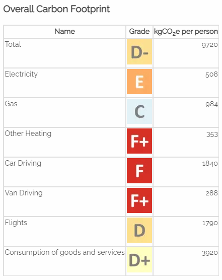
The report card for the main part of Sutton looks like this (A+ is better than average, G- is worse than average).
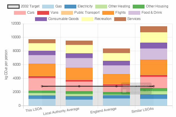
The website compares your local area with the rest of the district, with England, and with similar areas. For the main part of Sutton, that comparison looks like this.
The horizontal black line represents the UK’s target footprint per person as set out in the Committee on Climate Change’s 6th Carbon Budget, which covers 2032 to 2037. So how do we reach there from here?
This looks to be a really useful tool for helping local communities consider their carbon footprint. That’s something I’m keen to do, and have already had conversations with County Council officers about.


